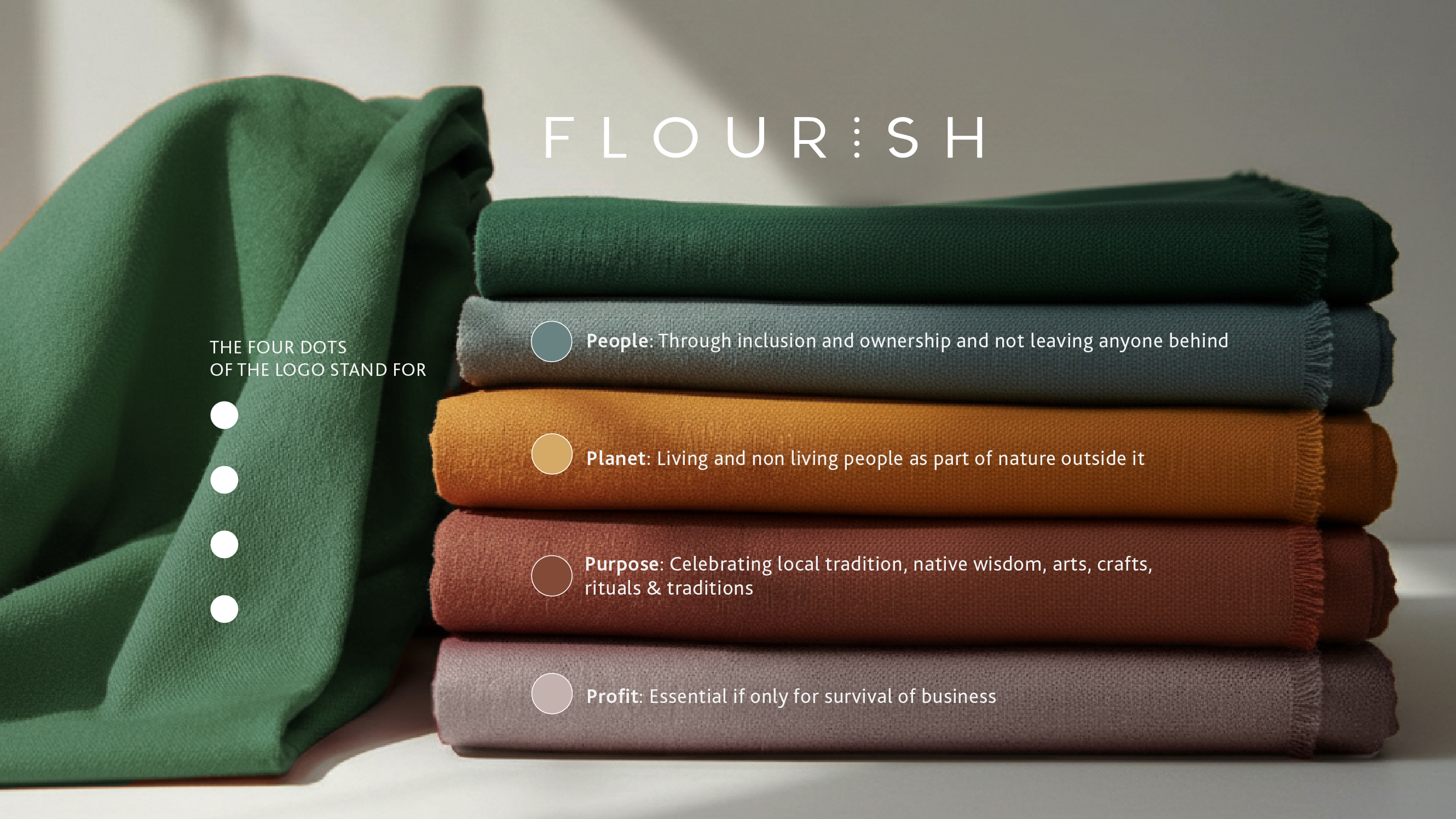
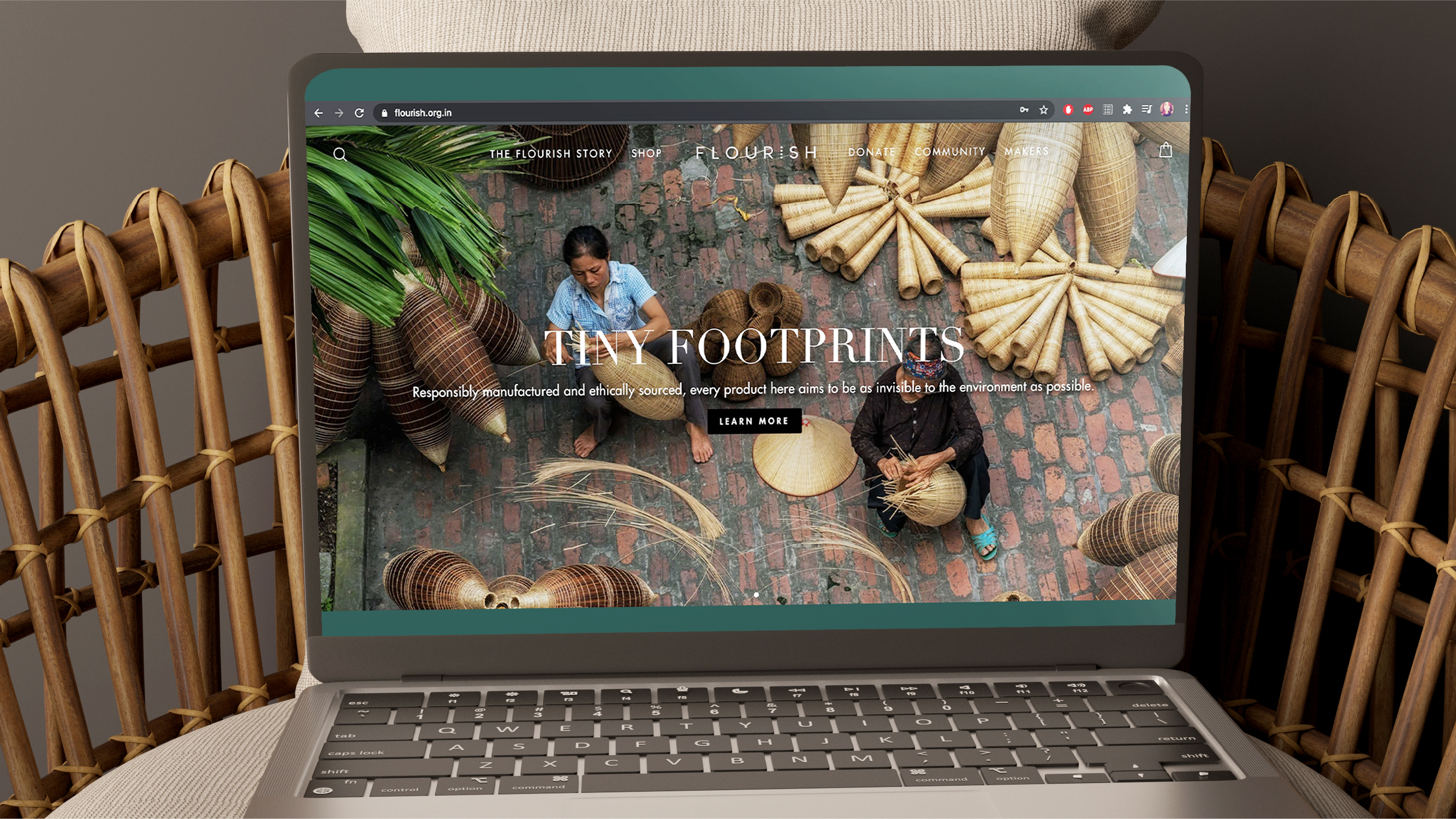
Building the go-to marketplace for sustainable products
Flourish sought to become the Amazon for sustainable goods, hence naming to navigation, every element had to make conscious consumption feel achievable and desirable.
.jpg)
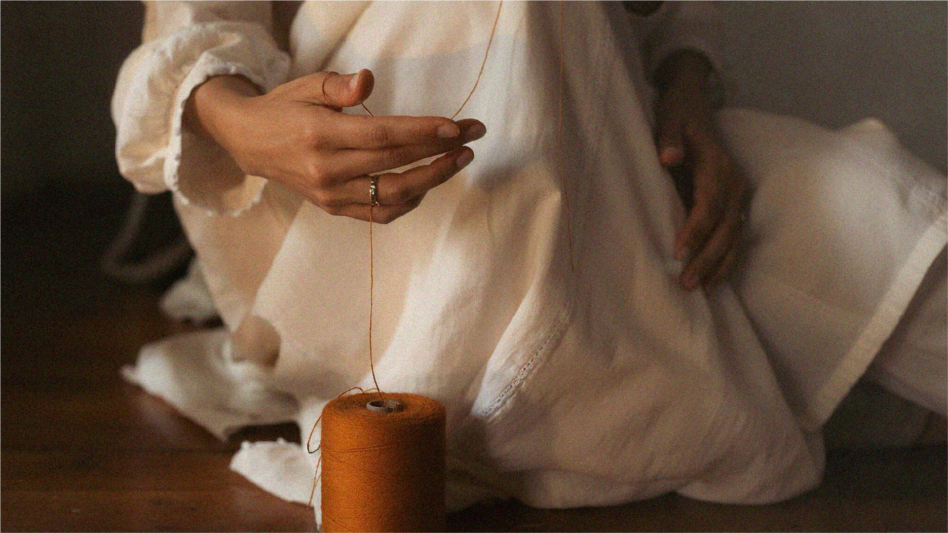
Made from Good: Cracked a platform idea that won’t just market the product, but the maker ecosystem behind it. This seamlessly translated into a premium yet accessible brand identity and e-commerce platform.
E-commerce functionality with editorial storytelling craft: Connecting consumers to the real artisan stories behind the craft they were interacting with.
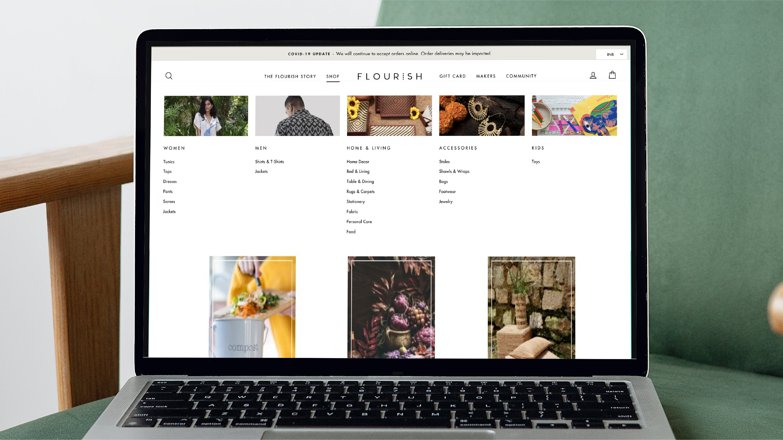
Exploration over efficiency: A navigation philosophy that places equal importance to "Shop," "The Flourish Story," "Makers," and "Community". Design cues like large imagery, clean layouts, and white borders that encourage browsing rather than rushing to checkout.
.jpg)
Dedicated makers page: Accentuating Flourish’s core differentiator: an artisan-first philosophy. Custom sustainability badges for users to filter and explore what resonates with them, then shop accordingly.
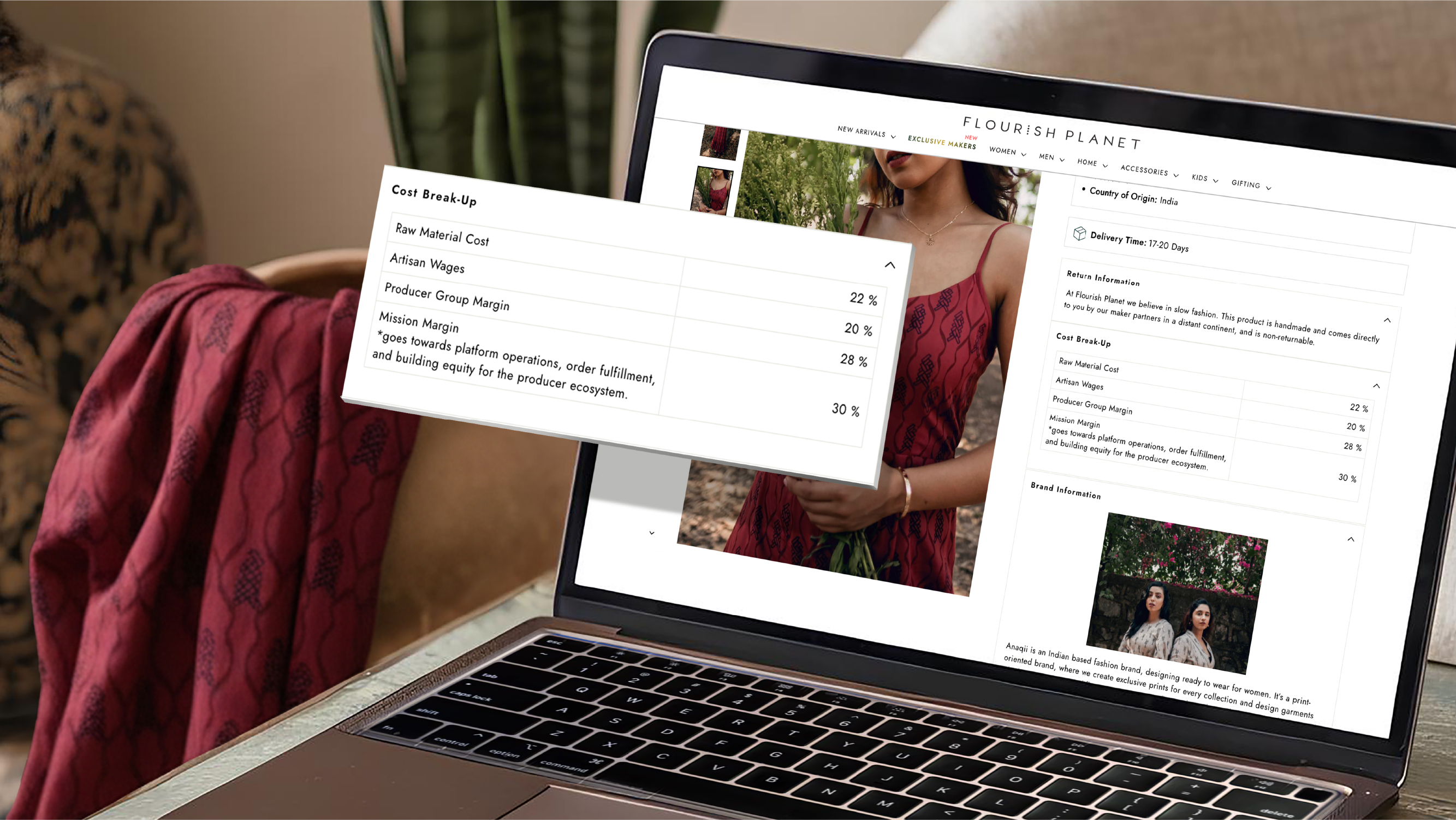
Radical transparency: In an industry first, we added a complete cost breakdown showing where every rupee went - raw materials, artisan wages, producer margins, etc.
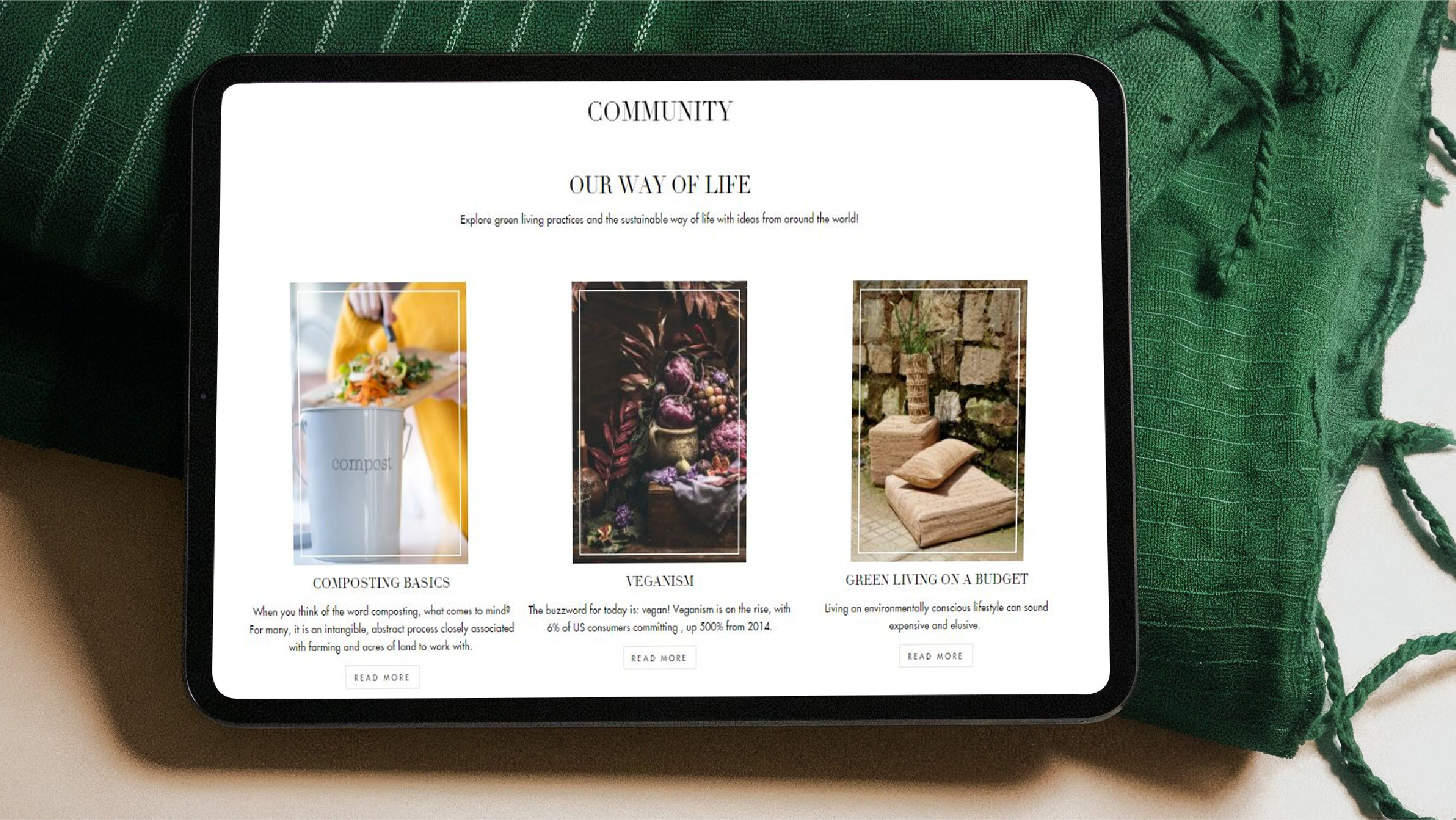
Community section: Engaging with artists through editorial pieces about relevant themes - craft techniques, green practices and collective action.
