Designing the interface of a new type of payment app in the pre-UPI era
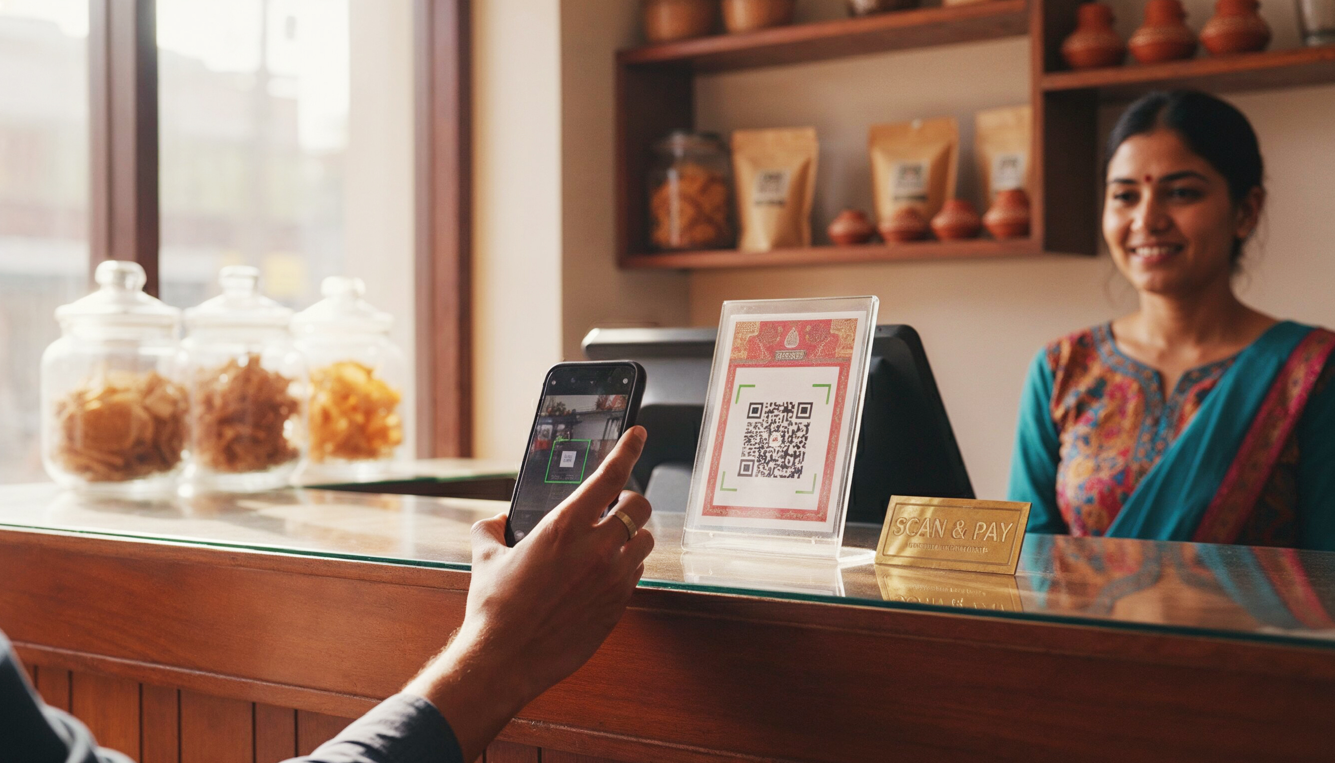
Swink launched an app for users and merchants to accept digital payments via QR Codes.
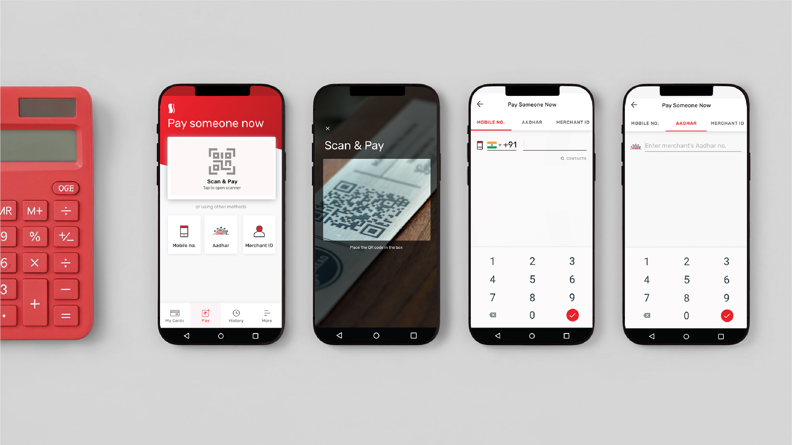
Easy home screen accessibility: Allowing users to instantly pick their preferred payment choice on app launch - QR scan, mobile number, Aadhaar, and merchant ID.
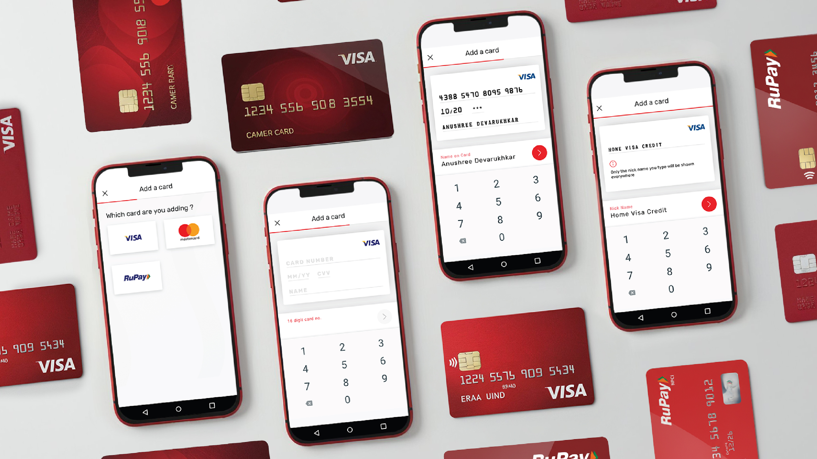
Skeuomorphic design: Users can see exactly what card details are required upfront and in a digital card that is designed to look like their actual credit cards.
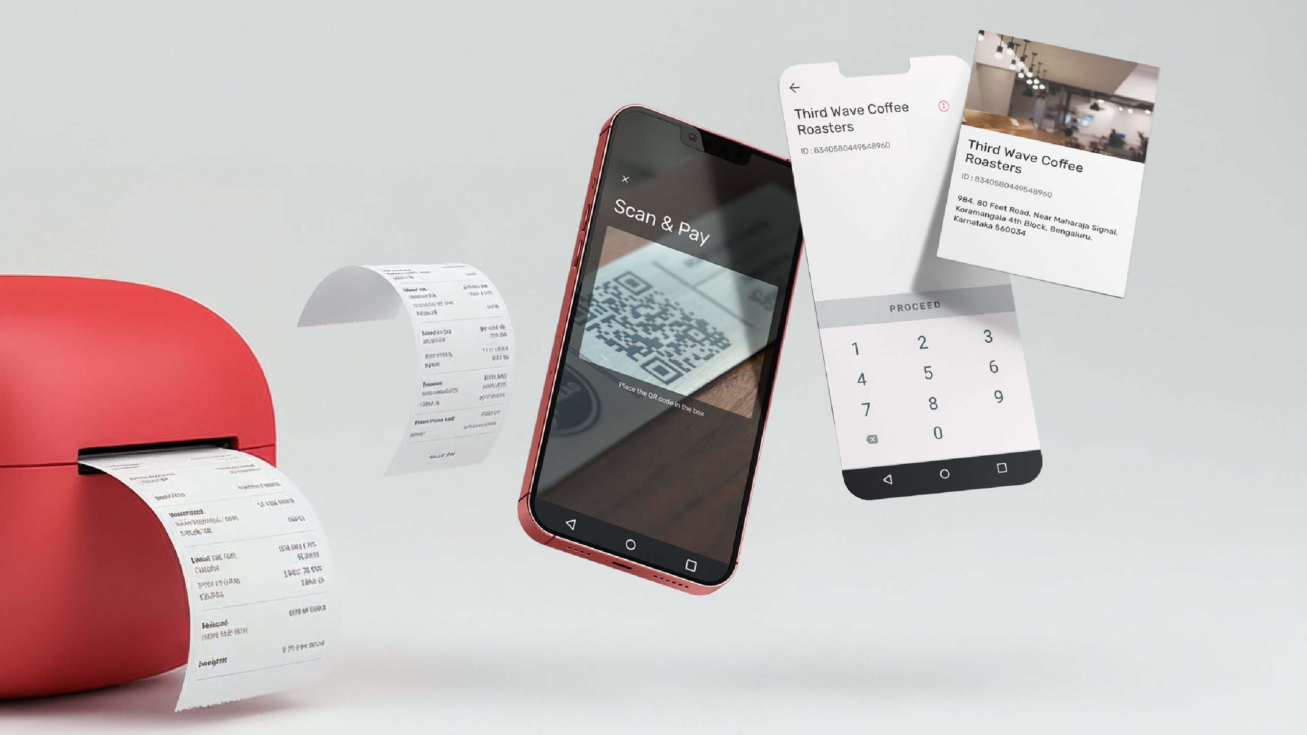
Real-time merchant details: When scanning a QR code, merchant details surfaced before payment initiation, bolstering credibility and reducing perceived risk.

Simplified pre-payment screen: We designed a pre-payment screen to show only essential information; introduced horizontal full-card scrolling so users could recognize the right card with visuals rather than text.
Easy to grasp usage insights: Transaction history combined chronological listings with visual spending graphs and flexible filters to instantly answer "Where did my money go?".